micro•macro
The original idea of the start-up was to create an application designed for farmers, with the goal of helping them assess the biodiversity of their fields. The approach was centered on a specific indicator: counting ladybirds as a measure of the health of the local ecosystem.
Within this context, the name “micro- macro” arose naturally. It embodies the application’s ambition: to highlight the link between elements of the microcosm, such as insects, and the macrocosm represented by the entirety of the field.
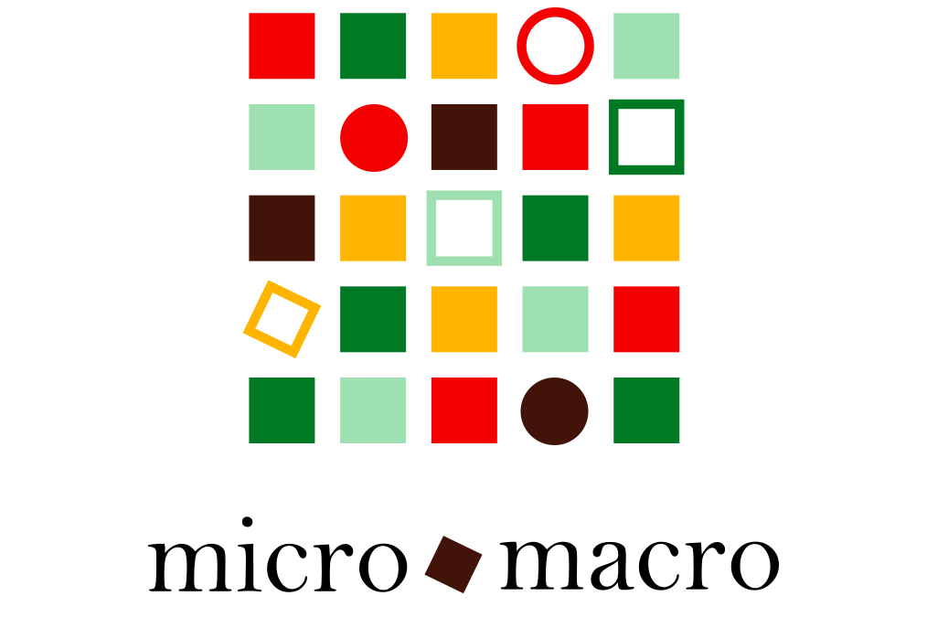
The visual identity is built around a checkerboard pattern where each square, whether round or square-shaped, adopts a shade of green, brown, or yellow, evoking the agricultural landscape and the natural world. Accents of red, a nod to the ladybug, punctuate the design. This composition instantly conjures the image of fields as seen from above, while illustrating the richness of the ecosystems within them.
The overall visual illustrates the multiple layers and interactions among the components of biodiversity, while also reflecting the synergy that arises from their connection.

