micro•macro
The original idea of the start-up was to create an application designed for farmers, with the goal of helping them assess the biodiversity of their fields. The approach was centered on a specific indicator: counting ladybirds as a measure of the health of the local ecosystem.
Within this context, the name “micro- macro” arose naturally. It embodies the application’s ambition: to highlight the link between elements of the microcosm, such as insects, and the macrocosm represented by the entirety of the field.
The visual identity is built around a checkerboard pattern where each square, whether round or square-shaped, adopts a shade of green, brown, or yellow, evoking the agricultural landscape and the natural world. Accents of red, a nod to the ladybug, punctuate the design. This composition instantly conjures the image of fields as seen from above, while illustrating the richness of the ecosystems within them.
The overall visual illustrates the multiple layers and interactions among the components of biodiversity, while also reflecting the synergy that arises from their connection.
Other projects in the portfolio
Hybrid Poster • SIMAW
Design of an hybrid A3 poster (front) / A5 flyer (back) for the international early music seminar in Wallonia.
Logo • IFCM
Logo proposal for a competition
Branding • Éditions Modulation
Branding for a music publisher.
Cover • Éditions Modulation
Design of sheet music covers for a music publisher.
Augmented school book • Areeka
Creation of an augmented book for children, illustrations included - cover, layout, content
Branding • micro•macro
Branding for an Agritech start-up specialised in biodiversity.
Augmented school book • Areeka
Creation of an augmented book for children, illustrations included.
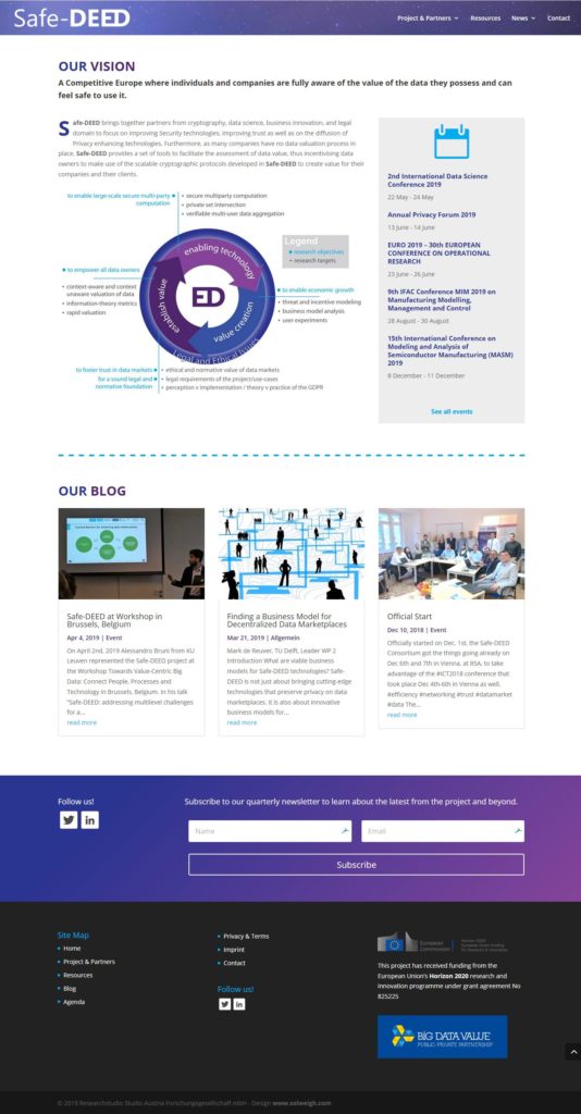
Website • Safe DEED
Project of the European Research and Innovation Programme - Horizon 2020.
Branding • Les Hirondelles
Branding for a bookshop
A3 Poster • le Cercle
Poster designed for an event organised by the association le Cercle.
A3 Poster • le Cercle
Poster designed for an event organised by the association le Cercle.
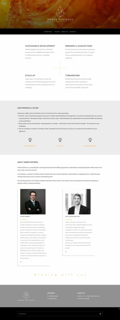
Website • Amber Partners
Creation of a website for a consulting firm.
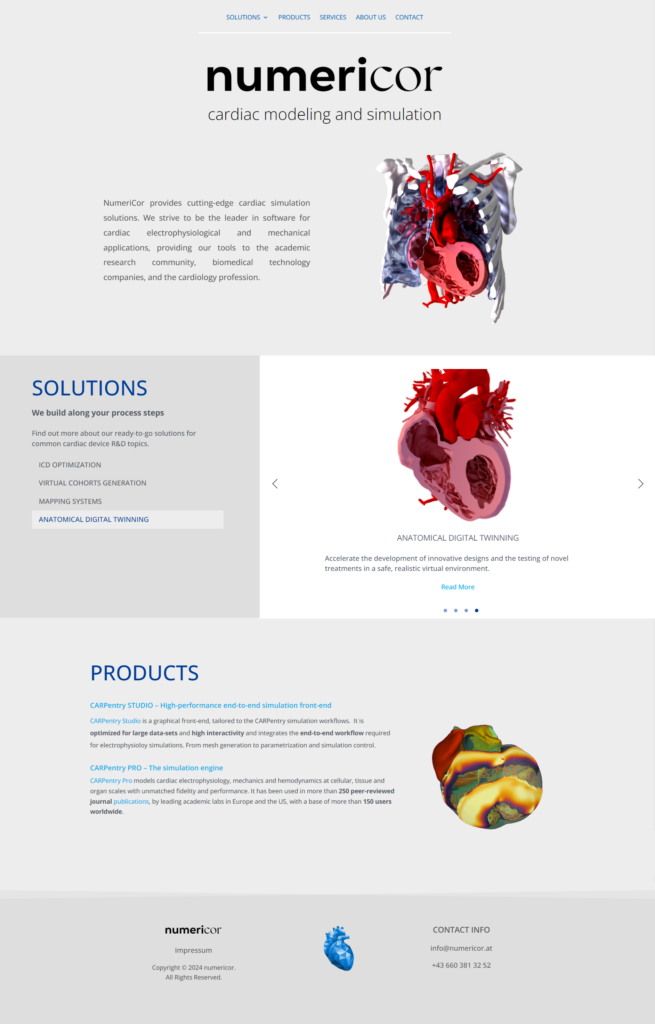
Website • numericor
Creation of a website and revamping of the branding of an Austrian SME specialised in cardiac simulation solutions.
Branding • Jeffrey Moses
Design of a graphic identity for a company in the field of data analysis
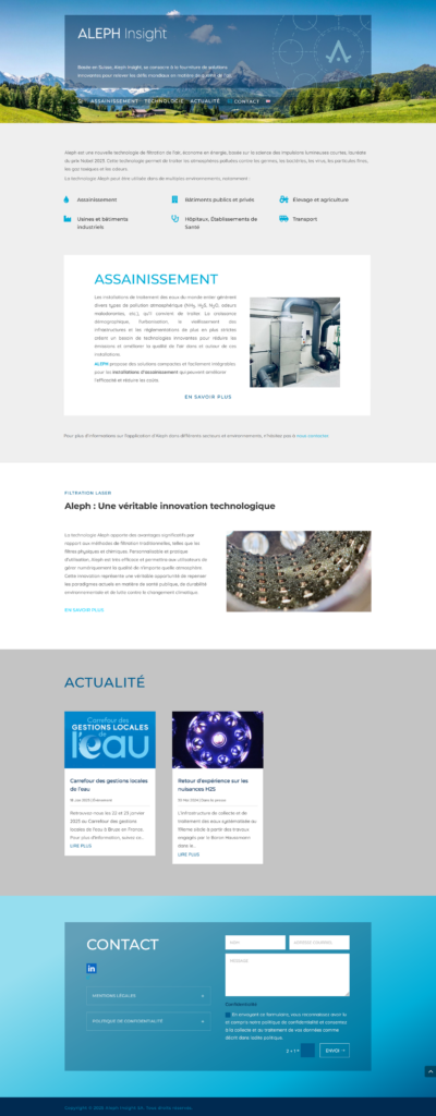
Website • Aleph Insight
Design of the website for a Swiss SME specialising in industrial air purification.